Showing posts with label BEDROOMS. Show all posts

String, a walk to the dark side


The beginning of the year brings always great excitement for all the news coming from the different brands for their Spring/Summer campaign. Of course, I have my favourite ones to be looking for: they are selected for both the quality and durability of their products and their outstanding ability to communicate and inspire us new way of inhabit the everyday space. Among these it is String new catalogue, again a joined work of long-time favourite Lotta Agaton (style)Magnus Ingerstedt (AD), Marcus Lawett (photo).


String has always been synonymous of adaptability to space and necessity by the possibility of moving the pieces within the different panels as well as adding new elements to the existing ones. This year, thanks also to the introduction of new shades for both shelves and panels (the115 cm tall floor panels will be available also in black and in grey), a new horizon of combinations is made possible. 

For String 2016 catalogue, a clear statement has been done: it is definitely time to embrace dark and earthy colours at home (have you seen this breathtaking all black styling featuring the new, black stained ash?). 


The light and elegant String system, to me always connected to whiteness, is making now a bold statement by showing how it can actually adapt to any space and style, taking their well known flexibility to a new concept and chapter. 
So, here it is in the Plexy version in an antique vintage bathroom, while the more classic combination in walnut fits perfectly as an entrance console in the masculine scenario. The old industrial look is maintained for the more feminine bedroom where Pocket with oak shelves is used as multi-function element that serve as traditional shelves and, contemporary, as bedside tables.


I would personally put a String in any room, from the kitchen to Bianca's nursery: what about you?

Pictures courtesy of String, with thanks.

WEEKEND SPECIAL | Home renovation by Studio Four


Studio Four is a multi-disciplinary studio based in Victoria, Australia, whose Ridge Road Residence was one of the finalist projects in the Houses Awards. The studio also received a special mention in the internationally acclaimed architizer a+ awards.

The Albert Street home presented here is a Victorian building located in Melbourne. Its previous spatial structure was transformed by Studio Four into a space able to adapt to the constant-changing need of modern families. The interior design, based on a soft and neutral palette of colours and materials, is full of light thanks to the use of concealed sliding doors and oversize windows.
But it is the strong dialogue between interior and outdoor space that caught my attention, especially in the kitchen-backyard block. Here, the space flows trasnforming the outdoor space into an extra room for the family. The pale wood chosen for the joinery and flooring is repeated in the outdoor table and bench creating a visual continuity also in terms of materials. The view of the kitchen from the backyard is stunning: the pale oak island stands out perfectly against the white background of thin metallic shelves and cabinets. 
Truly, a beautiful space.
 

Happy weekend!

FOCUS ON | Minimal bedroom in grey


I stumbled upon this work from Swedish agency Fantastic Frank last week-end. Particularly, I liked the minimal, simple bedroom and its light Japanese touch: the green branch in the image above looks almost like an Ikebana. Our sight is guided towards this focal point and make you wonder what's beyond, creating the urge to discover more. The overall atmosphere is calm and relaxed.


White minimal bedroom


Simply a picture I fell in love with, just a bit more inspiration for the day.

Photography Mia Josefsson


FOCUS ON |Grey softness


I have no idea if it is for the nature of light in these pictures or for the soft appearance of the beds but wouldn't you like to spend a whole Saturday in one of these rooms?  And all these grey shades turn out to be so calming and restoring.

FOCUS ON | Bedroom details


Some detail can add lot of character and create just the perfect atmosphere like the small black lamp next to the bed or a few magazines tied together. And what about those elegant Monstera leaves?

| 1 | 2 | 3 | 4 |

Llamas Valley

This is the BIG NEWS WEEK. As you have probably noticed, I haven't been posting very often recently and the reason is ... I have been busy trying to get our home ready for an interview and photo shooting with the amazing people at online magazine Llamas Valley! It was very exciting to get everything ready and style the details but also a bit of a "tour de force" (for the cleaning, mainly). The article will be published in the English issue of the magazine, probably by the end of July. I cannot wait to see it! For now, I leave you with some pictures I took in our bedroom. You can see more pictures in my Instagram account here. A big thanks goes to Indre and Tim: great team!


PS: Sorry for the quality of the pictures but, as you probably know if you follow my IG account, my camera got broken last week... Sigh.

Nina Holst

This beautiful minimal bedroom belongs to Nina Holst, the lovely blogger behind Stylizimo. I've been following Nina for a while and joined Stylizismo some time ago and she has been the best host I ever had: caring, always prompt to reply and with some of the most inspiring interior pictures you can find in the net. A soft elegance pervades her place thanks to the textures given by fabrics and to the harmonious colour palette. In this room, she transformed the curtain into a prominent element by extending the surface beyond the window limits, creating an interesting juxtapostion to the dark grey wall. I also liked her "outfit planning rod": it reminds me  Likainen Parketti's one but with a contemporary hint. 


Intsight and me

It's a perfect day so far. I spent part of the morning in a nice coffee shop talking to Montse Vicens, the charming founder of interior design and branding firm Intsight. If you have been following my blog for a while, you know how much I appreciate Intsight work for their ability to create outstanding, iconic spaces where smart simplicity is a key-element.
Not only I had a good time but it was very interesting to know better the concept behind the firm: Intsight has a free, flexible approach able to adapt to many kinds of projects and clients, offering  "low cost" inspiring solutions to interior (and more) issues, from simple things like "how can I organise my living room" to "we need a new, coherent image for our brand".  We also talked about one of their last projects, Mik Max, a Spanish textile company specialised in home decoration. Intsight developed a new visual identity for the brand and updated their catalogue. For sure you will know more about this last project as Mik Max is about to launch their new web and shop but, until then, here it is a series of images coming from Intsight web.

Interior stylist: Intsight .
Photographer: Mireia Rodríguez.
 

If you are new to the blog, do not worry: you can check previous posts about Intsight here and here or visit their newly launched web. As for the second part of the day, well, you'll need to wait until tomorrow to see my pictures of &Other Stories  new shop in Barcelona!

White bedroom in Stil Inspiration


I believe it takes a great amount of talent to come out with such a refined deoration: this bedroom by Pella Hedeby from STIL INSPIRATION manage to combine simplicity and character while creating such an intimate and elegant atmosphere. " Bedroom styling in white, with champagne coloured details and simple graphic contrasts" is how the interior stylist describes it in her blog. To me, it's simply perfect. 
Design details || Floating cubic shelf is Curve from Bolia | Sheepskin alternative is Oleby from Ikea in a creamy tone | Hanger is Mulig by Ikea. 


Simple Scandinavian


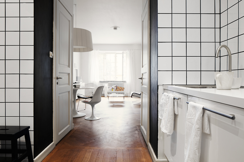
Isn't the light in this space simply perfect? My favourite space is the kitchen: I have fallen in love with the tiles!


Source

Inspired: Industrial bedroom


I've just seen this posted in Vosgesparis and I could not but re-blogged it: it's just the perfect inspiration for one of our "home urgent tasks": restore the "maybe" Tolix chairs we found at the flea market a couple of weeks ago. D. and me have been wonder what colour would have suited them better since we bought them. They still have traces of the original galvanised green painting but it is in such bad condition and I am not sure I'd like to have a green chair in my house because, at the moment, my colour scheme is white-black-white-wood-grey: very Mediterranean, isn't it? : )
So it was between white and black (with a hint of grey in each case) until I started to wonder about approaching them according to the restoration principle of allowing only the structure to be visible by taking away the layers of  . A very architectural definition of a simpler "take away dust and dirt" and those bits of galvanised painting that ruins it. I'm sure D. will find these i pictures so inspiring he will agree with me. Or, at least, I hope so. : )

Here are our beloved chairs.


Picture via my Instagram