Showing posts with label PLACES. Show all posts

Tinycottons headquarters in Barcelona


I struggle to believe how long it has been since I have been posting regularly here on facing north with gracia: these last 365 days (more or less) have been so intense from so many points of view I was left with little time and little energy.  Though my research haven't stopped, I felt I couldn't find that post that managed to kick my blogging off again. Do you think I had a sort of blogging blues? LOL.

Then yesterday I had the immense pleasure of visiting Tinycottons new showroom and offices and meet its founder, Barbara Bruno: my encounter with the brand happened in Instagram several years ago, at a time I had no idea of having babies. I loved their cool and minimal graphics and easygoing pieces: they looked confy and perfect to dress a life full of fun. I visited their first flagship store in Rambla de Catalunya last year and I knew the upcoming showroom would have been perfect for FNWG: 
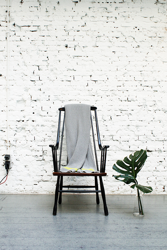
we share a love for all-white spaces, natural wooden and functional furniture and minimal interiors. During my visit I managed to shot some pictures to share with you: I hope you enjoy as much as I did!


The showroom is located in the lower Via Augusta, close to Diagonal and next to one of the creative spots of the city, Carrer Seneca. The space is completely white, capturing the beautiful Mediterennean light coming from the big windows. Here, the display is kept at its minimum: low plywood cupboards are used to showcase some of the most iconic pieces from their "Botanical" SS16 collection. The same module is used also for the big ones inside, creating a cohesive sense of the space.


Along with pieces of their collection, Tinycottons decided to populate the showroom with a selection of their favourite design pieces for kids and their spaces. 


And here it is a close up of Tinycottons "Botanical- a very bold and crazy  garden story", to me just the perfect outfit for any Urban Jungle Bloggers' baby out there.


All pictures by facing north with gracia.

Amsterdam | Volkshotel


 Last July, I talked to you about Volkshotel and it is now time to give you some more insights!

We spent there some great days during while in Amsterdam with the fellow Design Bloggers United: the rooms were essential, with an interesting industrial touch; I loved the iconic newspaper glasswall, a homage to the creative and editorial tradition of the building.

But it was the hall I particularly enjoyed during our stay. Designed as an open, welcoming space divided according to different functions, it hosts the reception and several sitting areas where you can chill out while waiting for friends to get ready, work or simply hang out if you are a local.


The vintage masculine style was very appealing and not cold at all, thanks to the amazing green walls of plants that provided both live and privacy from the street. 


I loved the raw materials combined with warm tones like dark red, rusty brown and ochre that complemented the grey and metal structures. It is undoubtedly a great place both for tourists and locals ( the bar at night was literally full up with party lovers from the surroundings), but especially my fellow  Urban Jungle Bloggers would love it!

Styling the perfect gathering


As you may recall from my first post about our Amsterdam Bloggerstour, I fell totally in love with Pistache Studio and it was amazing to witness the transformation of the rough industrial space into a cozy and perfect spot for our Bloggers United Dinner'. For this occasion, the group decided to gather some talented and creative people from the media and blogging world to spend a few hours together: at the end, isn't the best part of blogging getting to know and meet like-minded people?

Pistache Studio during the transformation.


To make this gathering so special, it was also the fantastic combination of sponsors that fell in love with the idea and decided to help us to create a magical event.  
Thanks to Thuesen Jensen, Pillivuyt Scandinavian agent, we were able to enjoy the French beautiful tableware, whose white and blue tones added a spectacular Mediterrenean vibe to the dinner, underlined by the Nigella flowers and wild grasses decoration. A touch of contemporary was instead introduced by the stylish 'Concrete Seats' by Fatboy.
And of course, in an event styled by Scandinavian design lovers like us, we couldn't miss candles: small tea lights were lighted as soon as the guest arrived but the real start of the night was our KOTO candle, brought especially for the occasion by one of Skandinavisk founders.

Ice cold beer provided by Beer & Co


When all the guests were seating, the mouthwatering delicacies - that we had been visually enjoying during the whole afternoon -  started to be served: the wonderful ladies of 'Lady Grey Catering'  created some great dishes and fueled the lovely and relaxed conversations.
 

After the dinner, the party started! The amazing guys at BOS Ice Tea and V2C Gin treated us with great cocktails while dancing and chatting on the sound of cool Libratone speakers


We had such an amazing night with our guests and sponsors you will surely see more of these events during out tours. Thanks so much to all the people that helped us making that nght so amazing and a special thanks to Uber, who made the visit in Amsterdam so perfect!

Photography by Susanna Vento and Linda Elmin

BLOGGERSTOUR AMSTERDAM | The seductive universe of Moooi


Unique and iconic are probably the two adjectives that fit best Moooi universe. The venture was founded in 2001 by world famous designer Marcel Wanders and Casper Vissers who had a vision: to create a collection of beautiful and unique obejects as stated by the very name of the company ( mooi means beautiful in Dutch).

With Wanders as art director, Moooi started to create a portfolio of works from both national and international designers, such as Studio Job, Nery and Hu or acclaimed Spanish Jaime Hayon. The style Moooi proposes is exclusive, playful with a touch of past times elegance that reminds of old palaces atmospheres. But Wanders' playfulness add a light touch to the whole collection, in an "antique meets modern" mood.

Moooi Amsterdam. Images by Susanna Vento

During our last Bloggerstour in Amsterdam, we had the chance to spend a whole afternoon at their 700 m2 space in the colorful district "De Jordaan", known for its tiny picturesque boutiques, stores, restaurants and art galleries in the heart of Amsterdam. Guided by Laura Ramos Bello-Kluit, the company’s winsome PR and Events coordinator, we could explore the store and discover how different designs came to life. Laura also organized for us a lovely challenge: each of the  Design Bloggers United was given one of the iconic Marcel Wanders' vases and invited to represent on it one of our fellow companions. 
Let's see if you can guess which one was mine, an unique collaboration between Allan Torp and Wanders!

The visit moved after upstairs for a superb surprise: a tour in the very Marcel Wanders Studio. It was great to see how the space was bustling with young and creative creative minds working in the most interesting projects, from interior designs to unique  pieces. We had a chance to go through a presentation of Wanders' most interesting works that, even of far from my personal taste, were in the overall extremely interesting. There were so many layers of history and research behind each of them that was almost unbelieveable how they managed to put all them together in a very coherent project: the result ccouldn't but be rich in both sense and output. 


All images by Susanna Vento

BLOGGERSTOUR AMSTERDAM | Studio Pistache


Last week I spent a few days with the Design Bloggers United group in Amsterdam for the second of our Bloggers Tours this year. We had an amazing time while visiting places like Mooi, Marcel Wanders Studio or the Andaz Hotel
But today I want you to show some pictures Susanna Vento took of Studio Pistache. The space is next to a Wood stove Pizzeria in the heart of the city and is usually rented for special gatherings and events. 


The rough industrial appearance of the space is mitigated by the soft light entering through the glassed roof creating a modern glasshouse atmosphere. I especially appreciate the contrast effect created by the light: it grows from dark to bright as you enter creating the illusion that the space is even bigger.  Closer to the end of the building is an area populated by specimens of tropical plants, like Euphorbias or palms.


The space is next to a Wood stove Pizzeria in the heart of the city but the Studio is usually used for special gatherings and events, as in our case: it was here we hosted our Design Bloggers United Dinner, an event I will tell you more in the next few days.

In the meanwhile, you can check some shots taken during the Amsterdam Bloggers Tour on my Instagram account or checking the tags #bloggerstour and #designamsterdam.

Stefan Diez for HAY | An office like a jungle


If I had to imagine my ideal studio, surely it will look very similar to this one: an open space probably with an warehouse past,  filled with light to create the perfect indoor environment to host an urban jungle.
The studio belongs to one of the most interesting German designers, Stefan Diez, based in Munich. His name is well known within the Scandinavian design world for Diez's collaboration with Danish brand HAY for the creation of a new generation of shelving system: the images pictured here actually belongs to HAY catalogue for Diez's New Order.


I find very interesting how HAY decided to make so visible the strong connection between the product and its designer by shooting part of the catalogue in Diez's studio. In a way, it becomes a manifesto of the importance of craft as an essential part of the design process. It also mirrors HAY's desire to reconnect to the glorious innovative craftmanship that made Danish design so famous during the 50's and 60's; also, it is a declaration of Diez's approach to design through an intense work with materials and technology.

However, New Order is a "100% industrial choice, [...], a high-precision product" that speaks our contemporary language: in a digital world where everything is stored online, the traditional office material is disappearing from our shelves, leaving space to display more objects and memories. Therefore, here it is the choice of many brands to re-think the traditional shelving unit; to make it versatile and flexible, able to both divide space and to create it. Just take a look at the image above: the group of two could actually be easily repeated at home, almost like an overlapping scenography populated by our favourite pictures, photographs, objects and curiosities. A wall-less room that could grow in height and length according to the movement of our life. Design has never been so human.


New Order is the shelving system for a new type of space, one that adapts to contemporary life and its needs of flexibility and, at the same time, is also a cocoon inhabited equally by plants and human beings in harmony.


Black holiday cottage in Germany


If I had to choose my ideal holiday home, surely it would resemble this cottage designed by German firm Format Elf Architekten. The black-stained building is part of the Hofgut resort, an estate that offers luxury accommodation, dining and spa close to the Bavarian forests. The archetypal structure of the cottage resembles the traditional barns and fit perfectly in the landscape. On the other side, the indoor is designed baring in mind all the comfort of contemporary living: a monochrome interior merge with natural wood surface to create a cozy atmosphere, perfect to evoke indulgence and slow life.


The architecture office also designed the outdoor area applying the same minimal approach they used for the interiors: a natural timber deck define the area reserved to the guests and lead to the outdoor dining space. Around, the informal natural planting merges with the surrounding landscape in a harmonious dialogue. The industrial-like elements of the dining furniture and the small concrete box grant a perfect contemporary look.

PLACES | Stunning shop in Glasgow


I love the interiors of this store in Glasgow. Designed by Spanish Tomás Alonso for the shoes brand Camper, it shows how a limited selection of materials can be used to create a space with a strong, unique character. The whole retail design is based on the combination of few elements: the 10x10 white ceramic tiles, the white powder coated steel and the white American oak of the furniture. Handmade lamps produced in Italy complete the picture.
The Camper shop in Glasgow is the third collaboration between the brand and the Spanish designer and reflects  Tomás Alonso's approach based on functionalism, minimalism and a close relation to everyday objects.


I find the visual geometrical patterns created by the variation of the tiles very interesting, what do you think?
Photography | Sánchez y Montoro

*** Get a chance to join FNWG GIVEAWAY here!  ***